
Premium Website Design Strategy: How to Build a Website That Reflects Your Brand and Converts
Business owners often ask a version of the same question: is there a formula for making a website look "premium"? A fixed set of fonts, colors, and layouts that instantly signal quality?
There isn't — and chasing one is usually why premium-looking websites still fail to convert. A website that feels high-end isn't built from a template. It's built from strategy: a clear understanding of what your brand stands for, who you're speaking to, and what experience you want them to walk away with.
A strong premium website design strategy brings these elements together, ensuring that every design decision supports your brand identity, connects with your audience, and contributes to your business goals.
Here's how to think about that strategy, and how to apply it whether you're a boutique service brand, a growing e-commerce store, or an enterprise platform.
Premium Is an Experience, Not a Style
A common mistake is treating "premium" as a visual style — lots of white space, muted colors, elegant serif fonts. That look works for some brands. It would be completely wrong for others.
What actually makes a website feel premium is that every element, from the first scroll to the checkout button, feels intentional. Visitors should sense that the site was built for them, not adapted from a generic theme. That feeling comes from strategy, not decoration.
Step 1: Define Brand Strategy Before Any Design Decisions
Design choices — color palette, typography, tone of voice, imagery — should all trace back to a clear brand identity. Without that foundation, a website ends up as a collection of attractive but disconnected pages with nothing holding them together.
Before opening a design tool, get clear on:
What does your brand actually stand for, beyond the product or service?
Who is the ideal visitor, and what are they hoping to feel or achieve on your site?
What tone fits the brand: minimal and refined, bold and energetic, warm and reassuring?
Two brands can both be "premium" while looking nothing alike — one built on stripped-back minimalism, another on rich color and texture. Both work if they're aligned with the brand behind them. Neither works if they're borrowed from someone else's brand.
Step 2: Design the User Experience Around Brand Positioning
Once the strategy is clear, it should shape how visitors actually move through the site, not just how it looks.
A brand built around simplicity and trust — a healthcare provider, for instance — usually benefits from a clean, low-friction experience: minimal steps, obvious next actions, no unnecessary decisions for the visitor to make. A brand built around exclusivity or discovery, like a retail or travel brand selling an experience rather than a commodity, can support more interactive, exploratory features — configurators, visual booking flows, guided journeys — because friction there feels like engagement rather than obstruction.
The right UX pattern isn't the fanciest one. It's the one that matches what the brand is promising.
Step 3: Choose Visuals That Support the Brand Story
Imagery, color, and layout should never be chosen purely because they look good in isolation — they need to reinforce what the brand is actually saying.
A B2B software platform selling precision and reliability will typically lean on clean interfaces, structured layouts, and restrained color use, letting the product itself carry the visual weight. A hospitality or lifestyle brand selling emotion and experience can lean into richer imagery, warmer tones, and more expressive typography.
The test isn't "does this look premium?" It's "does this look like us, to the people we're trying to reach?"
Step 4: Build Custom, Not Templated
Templates can get a site online quickly, but they rarely communicate individuality — and individuality is a large part of what makes a brand feel premium in the first place. Custom typography systems, considered layouts, and small bespoke interactions (a distinctive hover state, a thoughtful micro-animation, a genuinely custom navigation pattern) signal that real thought went into the build.
This doesn't mean every project needs a fully custom-coded experience from scratch. It means the design decisions should be deliberate choices for this brand, not default settings left untouched.
Step 5: Match the Design to Brand Personality, Not a Universal Formula
It's worth repeating: minimalism isn't a requirement for a website to feel high-end. A wedding or events brand might lean into soft, romantic visuals and delicate typography. A tech company might go bold, dark, and futuristic to communicate innovation. A children's or lifestyle brand might use playful color and motion to create delight.
The common thread across all of these isn't a shared aesthetic — it's that each one is deliberately built to match the brand and audience behind it.
Why This Matters Across Industries
This strategic approach plays out differently depending on the industry. A travel or booking platform needs an experience that makes a complex process — comparing options, configuring a trip, completing a booking — feel effortless and trustworthy. A healthcare platform needs to balance approachability with credibility, since visitors are often making decisions that matter to them personally. An e-commerce or retail brand needs visuals and interactions that make browsing feel enjoyable rather than transactional.
At Teenva AI & Digital Ventures, this is the thinking behind how we approach UI/UX design and web development for clients across travel, healthcare, e-commerce, and retail — starting from the brand and business goals, then building the design and technology around them, rather than starting from a template and hoping it fits.
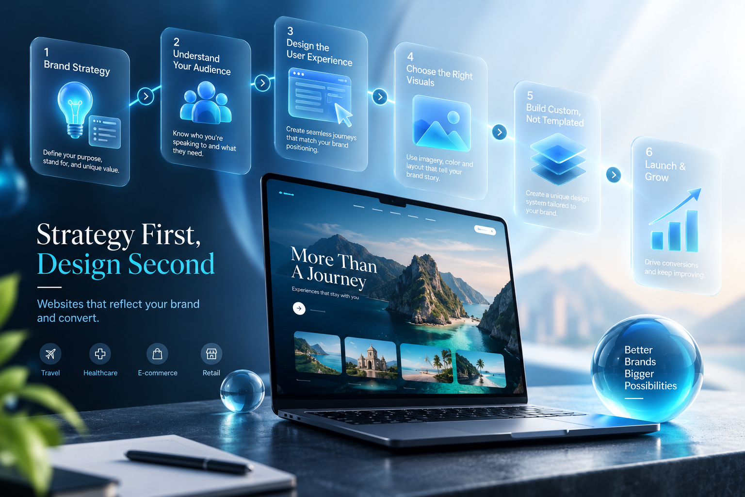
Strategy First, Design Second
A website that's strategically designed — where every decision from visuals to user experience is grounded in a clear understanding of the brand and its audience — does more than look good. It builds trust faster, communicates the right positioning instantly, and moves visitors toward action instead of just admiration.
If your website currently feels more like a collection of pretty pages than a strategic asset, that's usually a sign the strategy step got skipped, not that the design was done wrong.
Looking to design or rebuild a website that's actually built around your brand and business goals? Teenva AI & Digital Ventures designs and develops custom, conversion-focused websites for businesses across travel, healthcare, e-commerce, and retail. Reach out at sales@teenvaai.com, call +91 9572020107, or visit teenvaai.com to book a consultation and get your project started.