
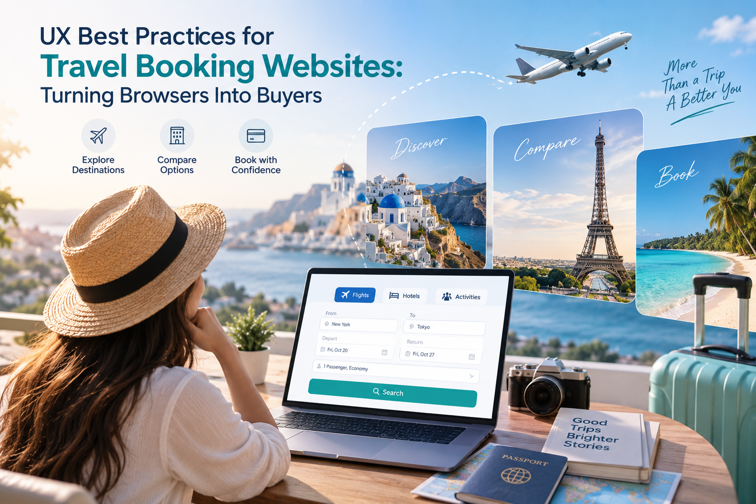
UX Best Practices for Travel Booking Websites: Turning Browsers Into Buyers
Travel booking website UX plays an important role in helping travelers move smoothly from exploration and comparison to confident booking decisions. Since travelers arrive with different goals and expectations, treating every user the same can create unnecessary friction and lead to lost conversions. The good news is that improving the experience doesn’t require a complete redesign—it often comes down to thoughtful structure, clear information, and delivering the right options at the right time.
Here's a practical look at where travel and OTA websites tend to lose users, and what to do instead.
Know Who's Actually Searching
Before touching a single form field, it helps to separate travelers into three rough groups:
Explorers — open to ideas, not yet sure where they're going
Comparers — price-sensitive, filter-heavy, opening multiple tabs
Decisive bookers — know the destination and dates, want to check out quickly
A search form built only for decisive bookers will feel like an interrogation to someone still exploring ideas. A form built only for explorers will frustrate someone who just wants to book flight 4B217 and move on. The fix isn't picking one audience — it's staging the form so the essentials come first and the finer filters appear progressively.
A few small defaults go a long way: pre-filling today's date as departure and tomorrow's as return, detecting location to set currency and origin automatically, and marking any optional fields clearly so people don't stall on questions they don't need to answer yet.
Make Search Results Worth Comparing
Search abandonment is normal — most visitors are comparing, not booking on the first pass. The real risk is losing people because results are hard to scan or missing the details that actually drive decisions.
What tends to matter most to travelers:
For stays: location, price, breakfast inclusion, Wi-Fi, parking, and genuinely useful amenity info — not just a star rating
For flights: price, layovers, baggage allowance, seat space, and in-flight extras
Letting users preview photos without leaving the results page, keeping the search bar editable and sticky at the top, and running A/B tests to see which details your specific audience actually cares about all reduce the number of back-and-forth clicks between search and decision.
Be Upfront About Pricing
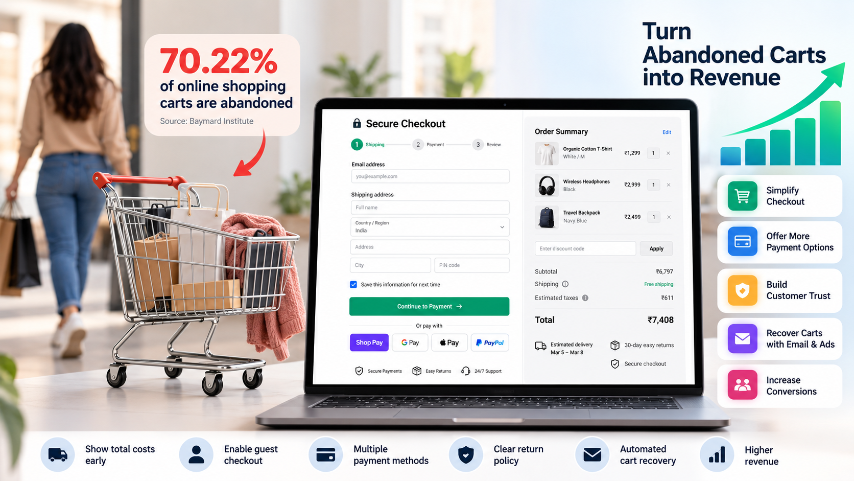
Few things kill trust faster than a price that grows at checkout. Resort fees, city taxes, and Wi-Fi charges that show up on the last screen push travelers to abandon the booking entirely — and often the brand along with it.
The fix is simple to state, harder to enforce across a product: show the full cost breakdown early, state clearly when something is free (not just when it costs extra), and be specific rather than vague — "free Wi-Fi in common areas, chargeable in rooms" beats a blanket "Wi-Fi included."
Don't Disappear After the Booking Is Made
The relationship doesn't end at checkout. A short window right before and during the trip is a genuine opportunity to be useful: airport-to-hotel transport options beyond just a taxi, a few essential phrases in the local language, or nearby recommendations based on the traveler's actual location.
This kind of follow-up does double duty — it reduces support tickets from confused travelers, and it gives the platform a reason to re-engage after the trip for reviews or the next booking.
Add a Reason to Come Back
Travel is emotional in a way most e-commerce isn't — people want to remember trips, not just complete transactions. Letting travelers track visited destinations on a map, log stamps or check-ins, or see stats like distance traveled turns a transactional platform into something people open even when they're not booking anything. It's a small mechanic, but it keeps the brand present between trips.
Let Real Travelers Do the Convincing
Most people planning a trip read a stack of reviews before committing, and they know some of them aren't fully trustworthy — they read them anyway. Text reviews help, but photos and short videos from other travelers tend to carry more weight. Making it easy to filter results by rating, and offering short structured review forms instead of demanding a paragraph, gets more people to actually leave feedback rather than skipping it.
Images Should Sell a Feeling, Not Just a Location
Generic postcard shots blend together after the tenth listing. Photos that capture atmosphere — what a morning there actually feels like, not just a landmark — tend to do more to convert interest into action. Small touches like hover-triggered detail overlays or subtle zoom can also make third-party photo sets feel more considered.
Personalize With Data You Already Have
Every one of the practices above gets sharper with personalization: search defaults based on past behavior, recommendations based on location, review prompts based on what someone actually booked. The travelers using these platforms are already sharing location and preference data — the opportunity is using it rather than guessing at what a "typical" user wants.
Building This Into a Real Platform
None of this is about a single redesign — it's an accumulation of small, deliberate decisions across search, pricing, post-booking engagement, and personalization. For OTAs and travel platforms working with multiple suppliers, GDS integrations, and real-time inventory, getting these UX patterns right alongside a solid booking engine architecture is what actually moves conversion numbers.
Teenva AI & Digital Ventures works with travel and e-commerce businesses to design and build booking platforms that get this balance right — from UI/UX design through to system integrations and AI-driven personalization. If you're looking to rebuild your booking flow or integrate a smarter recommendation layer, reach out to Teenva AI at sales@teenvaai.com or +91 9572020107, or visit teenvaai.com to see how we can help design it.