

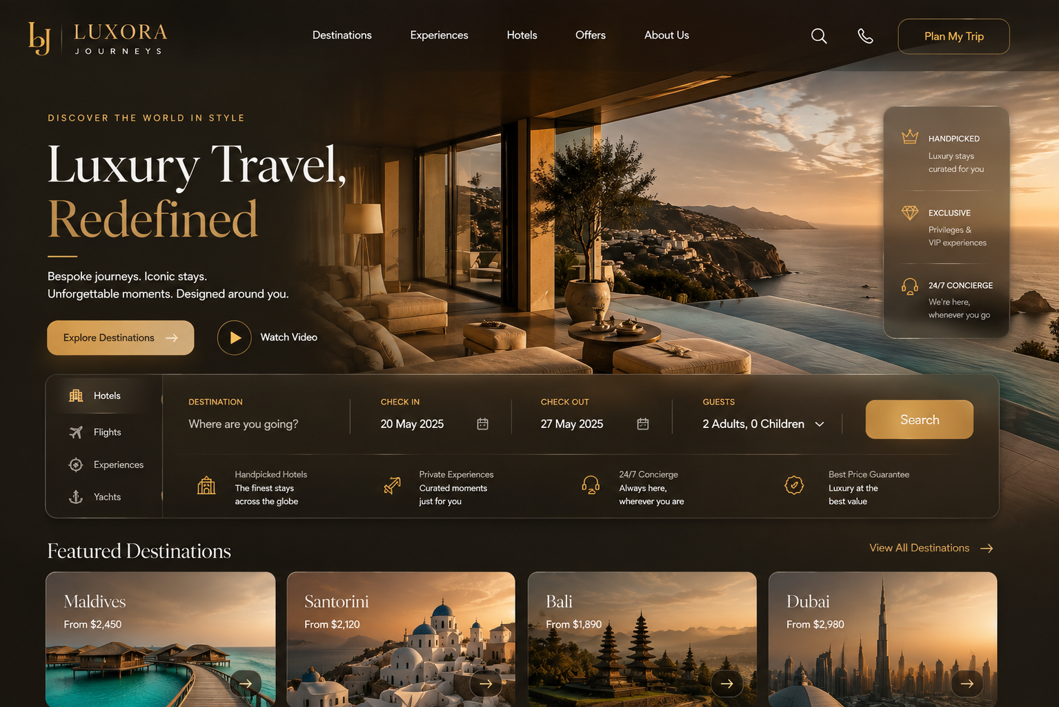
How to Design a Luxury Travel Website
How to Design a Luxury Travel Website
Visitors decide whether a website feels credible almost instantly — long before they read a single word of copy. For a luxury travel advisor or booking platform asking someone to commit thousands of dollars to a trip, that snap judgment carries real weight. It happens before your bio, your specialties, your pricing, or your testimonials ever get read.
So what actually separates a website that reads as "high-end" from one that just has nice photos? It isn't a color palette or an expensive photoshoot. It's a set of deliberate decisions working together — typography, imagery, layout, proof, and the booking experience itself. Below is a practical breakdown of each one, along with where the underlying technology has to hold up its end of the bargain.
What "High-End" Actually Communicates
A luxury website's real job is to communicate selectivity. The design and copy together should make it obvious who the site is for — and just as obvious who it isn't for.
This is where most travel websites go wrong. In trying to appeal to every possible traveler, they show everything: every destination, every trip type, every price point. The result reads as noise, and the underlying message becomes "we'll take anyone," which is the opposite of what a high-budget client wants to hear. Specificity signals authority in a way that breadth never can. A homepage that makes one clear case for one type of traveler tells a visitor that the business knows exactly who it serves — and chose that focus deliberately.
1. Typography Sets the Tone Before Anyone Reads a Word
Font choice is consistently underrated because it seems like a readability question. It's really a positioning question — typography communicates a brand's personality before any copy is processed.
A few practical checks worth running on any travel website:
Is body copy at least 16px on desktop? Smaller forces visitors to work harder than they should.
Is line spacing at least 1.5x the font size? Tight leading feels cramped and gets skimmed past.
Is there obvious contrast between heading and body type, in weight or style?
Are more than two typefaces in use? If so, one is probably unnecessary.
Typography also isn't a decision made in isolation. It's part of a larger visual identity system — if the color palette, logo, and overall brand haven't been designed with intention, even a well-chosen font ends up feeling like a costume rather than a personality.
2. Images Should Sell the Experience, Not Just the Destination
The real issue with generic-feeling travel photography usually isn't that it's stock — it's that it's non-specific. A site can use stock photography and still feel distinctly on-brand, or use original photography and still look interchangeable with every other travel site.
The better question for any image: does it convey the feeling of an experience, or just the location?
What tends to work:
Interiors over landscapes — a well-designed room, a set table, a lobby that looks like what it costs.
Detail shots over wide shots — texture, light, food, craftsmanship. These say this business notices things.
Color coherence — images and brand palette need to feel like they belong in the same visual world.
What tends to work against a luxury feel: cocktail-on-the-beach stock shots, cruise ship exteriors, anything that looks pulled from a resort press kit. A useful test: strip the logo off the page. If the image could belong to a hundred other travel sites, it isn't doing enough work for this one.
3. Layout and Whitespace Communicate Confidence
Whitespace isn't wasted space — it's a signal that a business knows what matters enough to leave the rest out. Crowded pages tend to communicate scarcity thinking, as if every offering had to be crammed onto one page because nothing could be cut. Spacious layouts do the opposite: they tell a visitor that what is on the page was chosen deliberately.
A homepage generally works best with this loose structure:
A few features worth reconsidering if they're still on a homepage: auto-rotating image carousels (research on carousel engagement shows the vast majority of clicks land only on the first slide — it's a documented conversion issue, not just a style preference), embedded social feeds that pull in third-party content and slow load times, and autoplay video heroes that hurt performance, especially on mobile.
4. Social Proof Needs to Be Specific to Convert
Generic testimonials — "wonderful to work with!" — don't move a client evaluating a five- or six-figure trip. What does move that audience is specific, outcome-driven detail: what the trip actually included, what problem it solved, how it felt once they were there. Concrete numbers — years of experience, booking volume in a niche, verified partner credentials — carry more weight than general claims of passion for travel.
Supplier and consortium logos are worth placing carefully too. On a homepage, a row of shared network logos reads as generic affiliation. On an about or credentials page, framed alongside what that access has enabled for real clients, the same logos read as earned expertise.
5. The Inquiry or Booking Form Is a Positioning Statement
This section is easy to overlook, but it's one of the highest-stakes parts of the page. The questions asked before a conversation even begins set the tone for the entire relationship. A form with a blank budget field and nothing else is interchangeable with every other advisor's form online.
A budget range field, used deliberately, sets the standard for who the service is for — clients self-select before a word is exchanged. Thoughtful qualifying questions beyond dates and destination signal that the business thinks about the whole trip, not just logistics.
This is also where design meets engineering. A luxury inquiry or booking flow needs to feel effortless: fast load times, clean validation, and — increasingly — real-time connections into GDS or supplier inventory so a "start planning" form isn't just collecting information into a void. This is exactly the kind of front-end-to-backend integration work Teenva AI & Digital Ventures handles for travel businesses, connecting a polished booking interface to the supplier and reservation systems behind it.
6. Don't Underinvest in the About Page
The about page consistently gets more traffic than expected, because visitors close to reaching out want to know who they'll actually be working with. It needs to do three things: tell a real, specific story (not a list of certifications), convey a genuine point of view on what good travel planning looks like, and show enough personality that a visitor can decide, before ever emailing, whether they'd like working with this person or team.
What Tends to Date a Website
A few patterns are reliable signals that a site hasn't been revisited in a while: rotating banner sliders, a destination gallery with beautiful images and no editorial point of view, copy claiming to "specialize in luxury travel to all destinations worldwide" (which, by trying to mean everything, ends up signaling nothing), embedded Instagram feeds, and a contact form that's just one open text box with no structure.
None of these individually breaks a website. But they compound, and each one is a fairly quick fix once identified.
Where Design Meets the Technology Behind It
A luxury look only holds up if the platform underneath performs at the same level — fast page loads, mobile-first responsiveness, secure payment and booking flows, and clean integrations with GDS, hotel, and activity suppliers. This is where a lot of otherwise well-designed travel websites quietly fall apart: the front end says "high-end," but the booking experience behind it is slow, clunky, or disconnected from real-time inventory.
Teenva AI & Digital Ventures works with travel businesses on exactly this intersection — UI/UX design paired with the system integrations, booking engine architecture, and AI-driven personalization that make a premium-looking travel website actually perform like one.
The Takeaway
Most of what holds a travel website back from matching the caliber of the business behind it comes down to specific, addressable decisions — typography, image selection, homepage hierarchy, form structure, social proof, and the about page. Each can be improved independently. But if the underlying platform can't support fast, secure, integrated booking, no amount of design polish will close the gap.
Ready to design and build a travel website that actually performs like a luxury one? Get in touch with Teenva AI & Digital Ventures at sales@teenvaai.com, call +91 9572020107, or visit teenvaai.com — we design and integrate luxury travel platforms end to end, from UI/UX through booking engine and supplier integrations.